How to Use a Legend

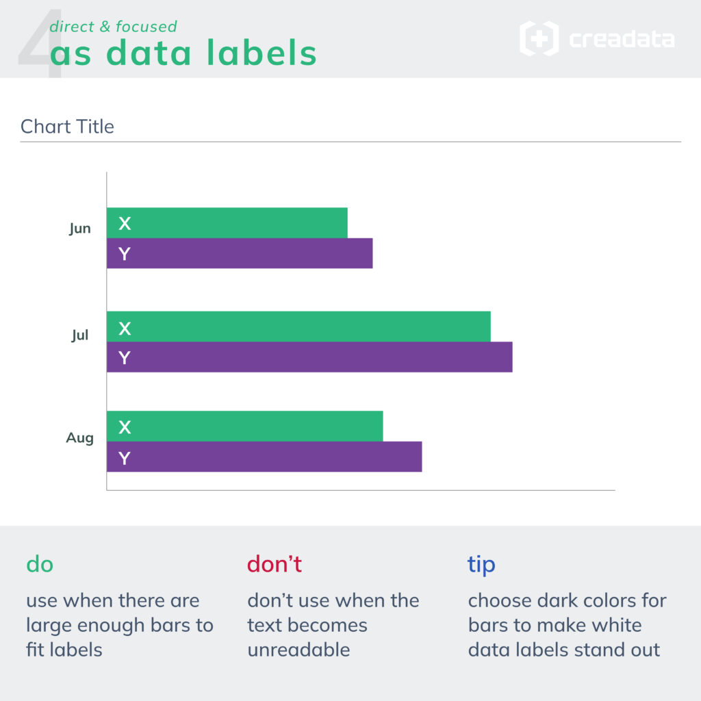
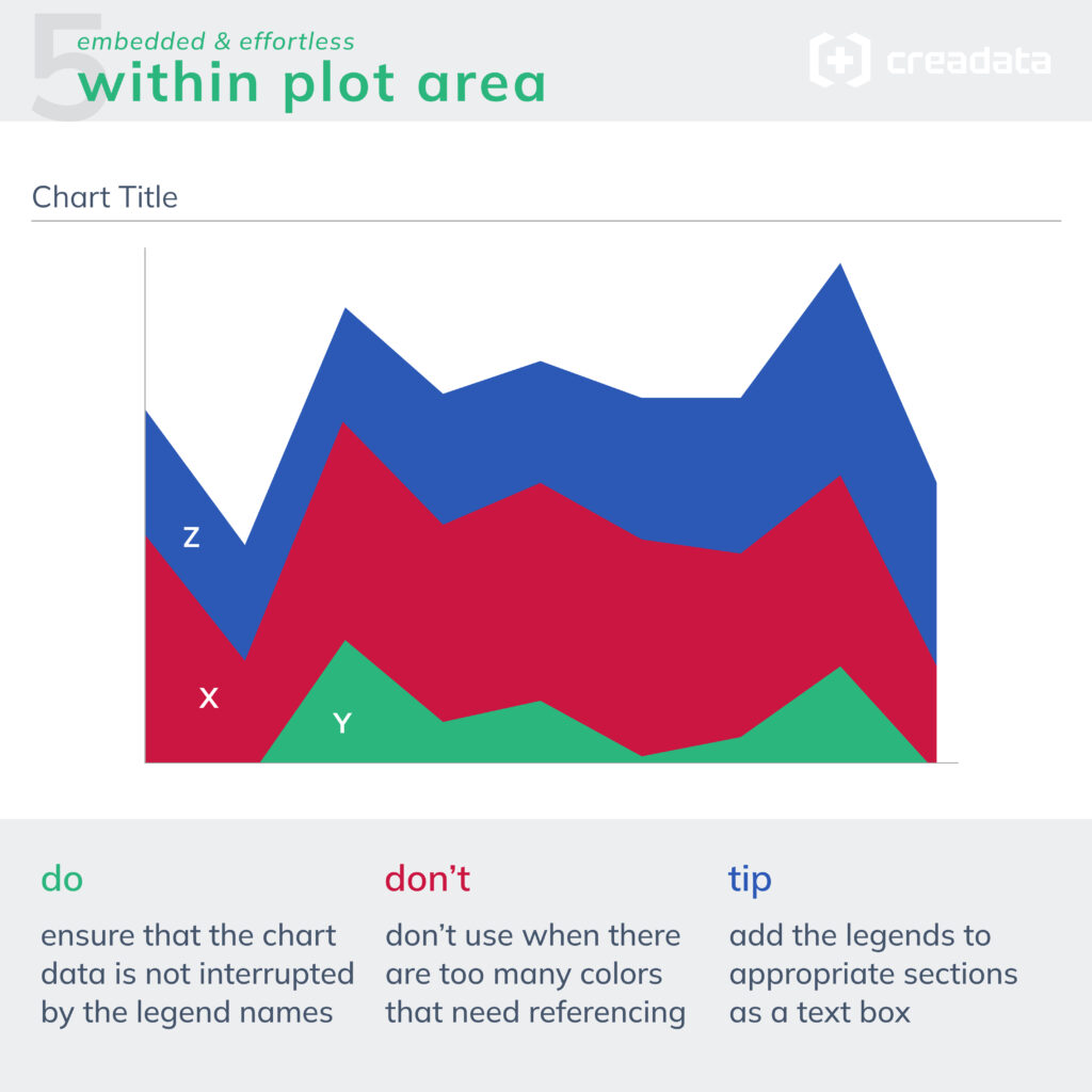
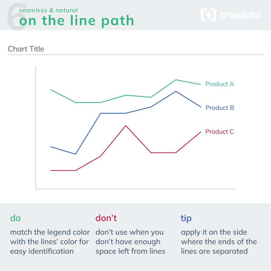
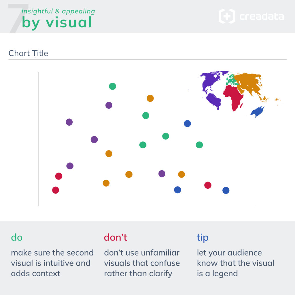

I wanted to raise this question by sharing a post on Linkedin recently: Is there a difference between a column chart and an area chart? If so, what is the reason? Which one should be used in which case?
The examples I used were the monthly turnover and the monthly cash in the cash register. What should we pay attention to when deciding to use columns or area in these examples? In order to answer this question, it is necessary to look at the difference between these two graphs.
One of the Gestalt principles in psychology that helps explain our visual perception is the Connectedness principle. This principle tells us that we think that shapes that are connected to each other have a common meaning, while those that are not connected have independent meanings.
The main difference between a bar chart and an area chart is that the values in these two charts progress independently or in conjunction with each other. The cases in our examples should also be evaluated based on this difference.
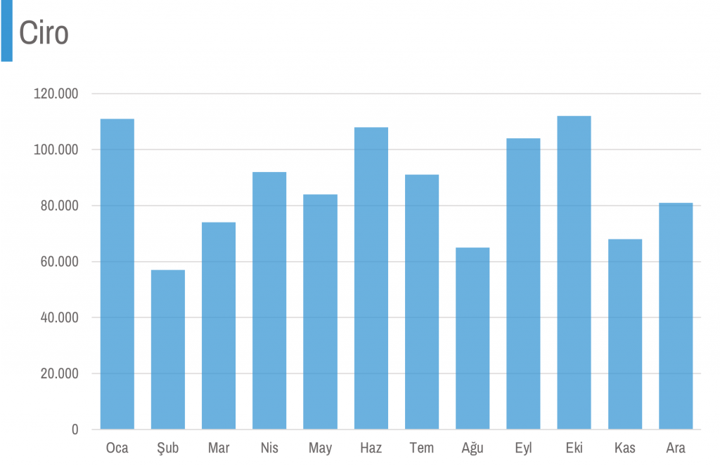
In the turnover chart, our monthly values are independent of each other. In other words, the 111 thousand turnover in January and the 58 thousand turnover in February are the values of separate sales, they have no relationship with each other. Therefore, for the turnover chart, it is more appropriate to use columns that visualize the values separately from each other.
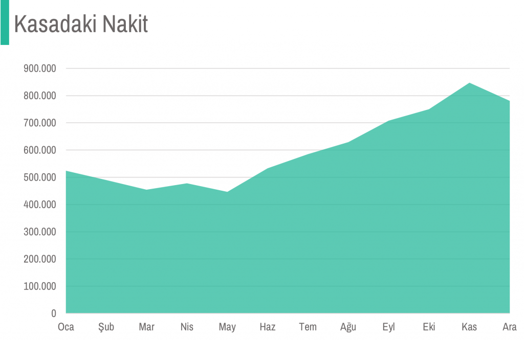
The situation is different with cash in the safe. Most of the 490 thousand cash in February is probably included in the 524 thousand cash in January. In other words, they are not completely independent values from each other, they are in the form of another value formed by changing one of them slightly. Therefore, it is more appropriate to create the cash in cash chart with a progressive area that is related to each other, rather than with columns that are visualized independently of each other.
Of course, this is not a strict rule. Although it is a general visual perception truth, our choice of graphs may change depending on the habits of the people who will read the graph and the size of the data.
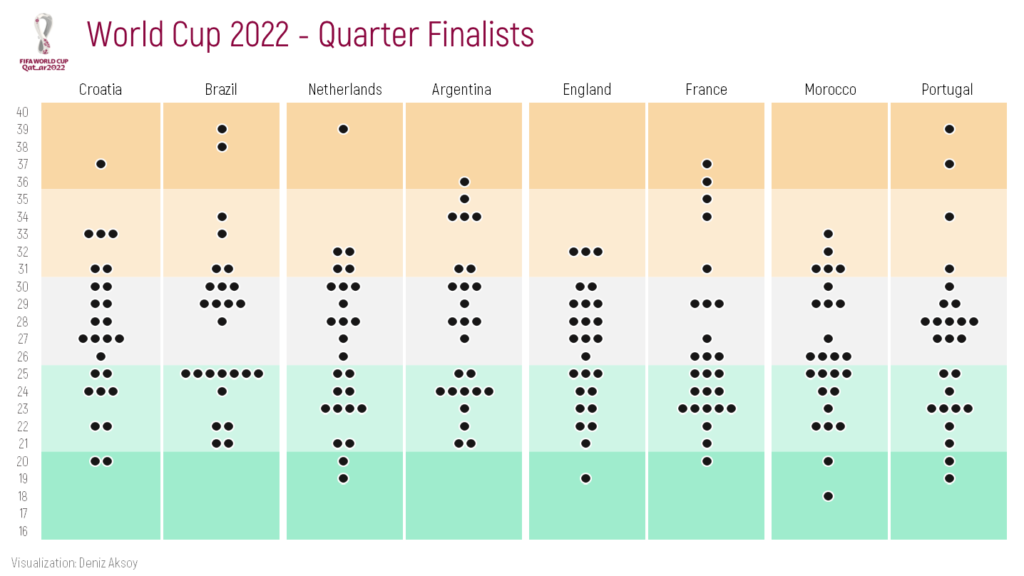
I want to create a bee swarm chart with World Cup 2022 quarter finalist teams’ data. Let’s make it step by step in Excel together.
Data I found on internet was as below. I copied the top 10 rows of the whole data here.
| No | Pos | Player | Date of Birth | Age | Caps | Goals | Club | Country |
| 1 | GK | Dominik Livaković | 09-Jan-95 | 27 | 34 | 0 | Croatia Dinamo Zagreb | Croatia |
| 2 | DF | Josip Stanišić | 02-Apr-00 | 22 | 7 | 0 | Germany Bayern Munich | Croatia |
| 3 | DF | Borna Barišić | 10-Nov-92 | 30 | 28 | 1 | Scotland Rangers | Croatia |
| 4 | FW | Ivan Perišić | 02-Feb-89 | 33 | 116 | 32 | England Tottenham Hotspur | Croatia |
| 5 | DF | Martin Erlić | 24-Jan-98 | 24 | 4 | 0 | Italy Sassuolo | Croatia |
| 6 | DF | Dejan Lovren | 05-Jul-89 | 33 | 72 | 5 | Russia Zenit Saint Petersburg | Croatia |
| 7 | MF | Lovro Majer | 17-Jan-98 | 24 | 11 | 3 | France Rennes | Croatia |
| 8 | MF | Mateo Kovačić | 06-May-94 | 28 | 84 | 3 | England Chelsea | Croatia |
| 9 | FW | Andrej Kramarić | 19-Jun-91 | 31 | 74 | 20 | Germany 1899 Hoffenheim | Croatia |
| 10 | MF | Luka Modrić (captain) | 09-Sep-85 | 37 | 155 | 23 | Spain Real Madrid | Croatia |
First, I need to count how many players there are of all ages, on each team. I used COUNTIFS formula for ages from 16 to 40.
| Ages | Croatia | Brazil | Netherlands | Argentina | England | France | Morocco | Portugal |
| 16 | 0 | 0 | 0 | 0 | 0 | 0 | 0 | 0 |
| 17 | 0 | 0 | 0 | 0 | 0 | 0 | 0 | 0 |
| 18 | 0 | 0 | 0 | 0 | 0 | 0 | 1 | 0 |
| 19 | 0 | 0 | 1 | 0 | 1 | 0 | 0 | 1 |
| 20 | 2 | 0 | 1 | 0 | 0 | 1 | 1 | 1 |
I will use a stacked bar to create a bee swarm chart. However, I want to add buffers to both the left and right of the bars in order not to make the bars (bees) of the players of different teams come together and to place spaces between them. Considering the maximum number of players (7) in an age, I set myself an interval: 10.
I calculate each buffer as half of (interval minus the relevant count). For example, for age 20, Croatia’s buffers (Buffer1.1 and Buffer1.2) will be (10-2)/2=4.
| Ages | Buffer1.1 | Croatia | Buffer1.2 | Buffer2.1 | Brazil | Buffer2.2 | Buffer3.1 | Netherlands | Buffer3.2 | Buffer4.1 | Argentina | Buffer4.2 | Buffer5.1 | England | Buffer5.2 | Buffer6.1 | France | Buffer6.2 | Buffer7.1 | Morocco | Buffer7.2 | Buffer8.1 | Portugal | Buffer8.2 | Interval | 10 | |
| 16 | 5 | 0 | 5 | 5 | 0 | 5 | 5 | 0 | 5 | 5 | 0 | 5 | 5 | 0 | 5 | 5 | 0 | 5 | 5 | 0 | 5 | 5 | 0 | 5 | |||
| 17 | 5 | 0 | 5 | 5 | 0 | 5 | 5 | 0 | 5 | 5 | 0 | 5 | 5 | 0 | 5 | 5 | 0 | 5 | 5 | 0 | 5 | 5 | 0 | 5 | |||
| 18 | 5 | 0 | 5 | 5 | 0 | 5 | 5 | 0 | 5 | 5 | 0 | 5 | 5 | 0 | 5 | 5 | 0 | 5 | 4,5 | 1 | 4,5 | 5 | 0 | 5 | |||
| 19 | 5 | 0 | 5 | 5 | 0 | 5 | 4,5 | 1 | 4,5 | 5 | 0 | 5 | 4,5 | 1 | 4,5 | 5 | 0 | 5 | 5 | 0 | 5 | 4,5 | 1 | 4,5 | |||
| 20 | 4 | 2 | 4 | 5 | 0 | 5 | 4,5 | 1 | 4,5 | 5 | 0 | 5 | 5 | 0 | 5 | 4,5 | 1 | 4,5 | 4,5 | 1 | 4,5 | 4,5 | 1 | 4,5 |
As next step, I will create a stacked bar chart with all dataset. Excel set the maximum of the x axis as 90 because we had a total of 80 for all ages.
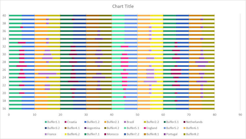
Then I will change the maximum of the x axis as 80 because I don’t need to see between 80 and 90 in the chart.
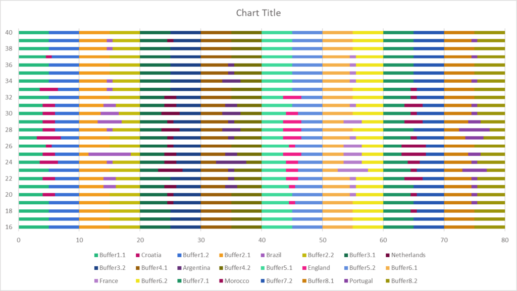
After that I will change the fill of the buffer bars to No Fill in order to hide them.
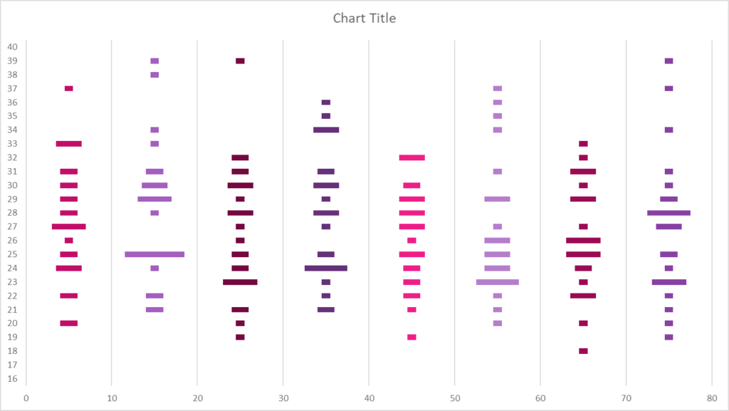
Afterwards, I changed the gap width to 50%.
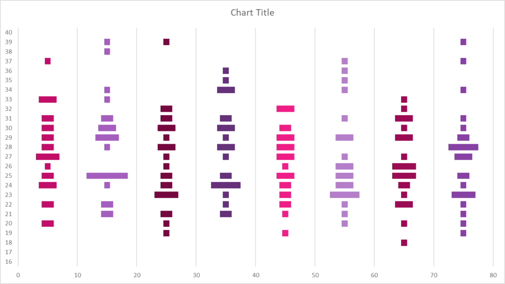
I removed the border outside the chart area and moved the chart title to the upper left corner for general format editing.
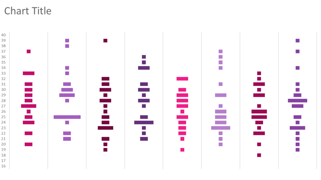
It’s time to create our bees 🙂 I copy and paste a circle inside the first team’s bars so that the size matches the size of the bar representing a single player.
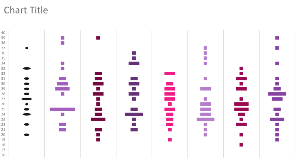
Then I right click on the bars with circles and choose Format Data Series. In the Picture Fill settings, I tick “Stack and Scale with” option, instead of Stretch.
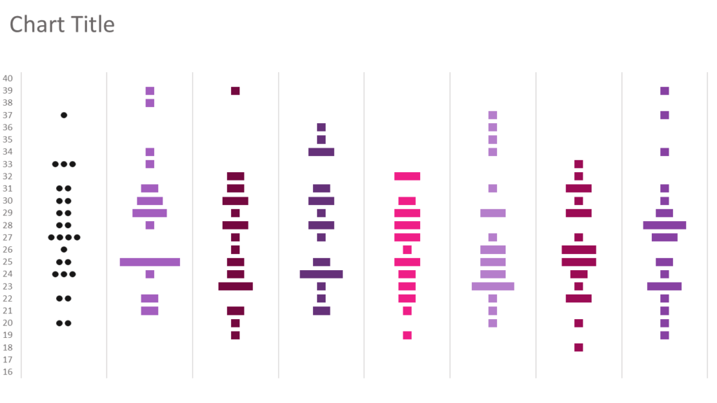
I repeat all the circle fill steps for the other teams. If you want you can change the color of the circles in order to create seperation or categorisation between countries. I used black circles (bees) for all teams.
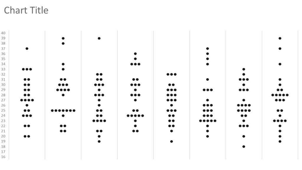
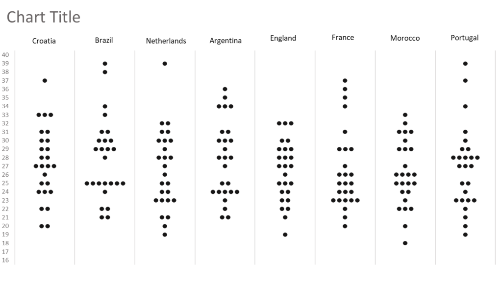
Then I added the name of each country as a text box.
Somewhere outside the chart, I stacked 5 equally sized rectangles and formatted them with diverging colors. Then I selected and copied all of them together and right clicked on the plot area, selected format, and placed the group with Picture Fill/Clipboard option.
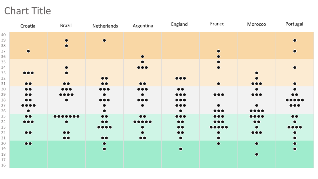
After the final makeups, my bee swarm chart is ready in Excel.
