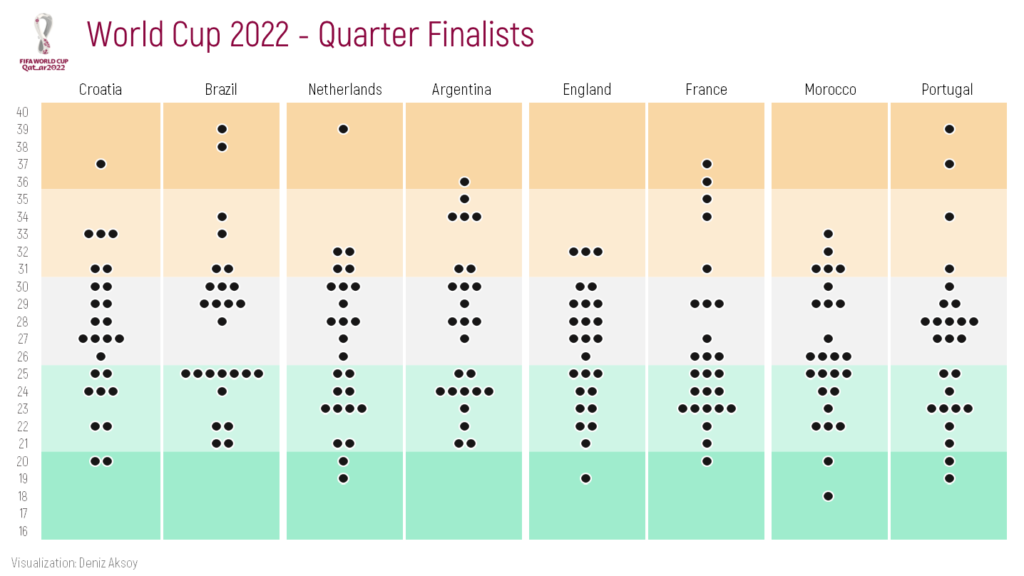
I want to create a bee swarm chart with World Cup 2022 quarter finalist teams’ data. Let’s make it step by step in Excel together.
Data I found on internet was as below. I copied the top 10 rows of the whole data here.
| No | Pos | Player | Date of Birth | Age | Caps | Goals | Club | Country |
| 1 | GK | Dominik Livaković | 09-Jan-95 | 27 | 34 | 0 | Croatia Dinamo Zagreb | Croatia |
| 2 | DF | Josip Stanišić | 02-Apr-00 | 22 | 7 | 0 | Germany Bayern Munich | Croatia |
| 3 | DF | Borna Barišić | 10-Nov-92 | 30 | 28 | 1 | Scotland Rangers | Croatia |
| 4 | FW | Ivan Perišić | 02-Feb-89 | 33 | 116 | 32 | England Tottenham Hotspur | Croatia |
| 5 | DF | Martin Erlić | 24-Jan-98 | 24 | 4 | 0 | Italy Sassuolo | Croatia |
| 6 | DF | Dejan Lovren | 05-Jul-89 | 33 | 72 | 5 | Russia Zenit Saint Petersburg | Croatia |
| 7 | MF | Lovro Majer | 17-Jan-98 | 24 | 11 | 3 | France Rennes | Croatia |
| 8 | MF | Mateo Kovačić | 06-May-94 | 28 | 84 | 3 | England Chelsea | Croatia |
| 9 | FW | Andrej Kramarić | 19-Jun-91 | 31 | 74 | 20 | Germany 1899 Hoffenheim | Croatia |
| 10 | MF | Luka Modrić (captain) | 09-Sep-85 | 37 | 155 | 23 | Spain Real Madrid | Croatia |
First, I need to count how many players there are of all ages, on each team. I used COUNTIFS formula for ages from 16 to 40.
| Ages | Croatia | Brazil | Netherlands | Argentina | England | France | Morocco | Portugal |
| 16 | 0 | 0 | 0 | 0 | 0 | 0 | 0 | 0 |
| 17 | 0 | 0 | 0 | 0 | 0 | 0 | 0 | 0 |
| 18 | 0 | 0 | 0 | 0 | 0 | 0 | 1 | 0 |
| 19 | 0 | 0 | 1 | 0 | 1 | 0 | 0 | 1 |
| 20 | 2 | 0 | 1 | 0 | 0 | 1 | 1 | 1 |
I will use a stacked bar to create a bee swarm chart. However, I want to add buffers to both the left and right of the bars in order not to make the bars (bees) of the players of different teams come together and to place spaces between them. Considering the maximum number of players (7) in an age, I set myself an interval: 10.
I calculate each buffer as half of (interval minus the relevant count). For example, for age 20, Croatia’s buffers (Buffer1.1 and Buffer1.2) will be (10-2)/2=4.
| Ages | Buffer1.1 | Croatia | Buffer1.2 | Buffer2.1 | Brazil | Buffer2.2 | Buffer3.1 | Netherlands | Buffer3.2 | Buffer4.1 | Argentina | Buffer4.2 | Buffer5.1 | England | Buffer5.2 | Buffer6.1 | France | Buffer6.2 | Buffer7.1 | Morocco | Buffer7.2 | Buffer8.1 | Portugal | Buffer8.2 | Interval | 10 | |
| 16 | 5 | 0 | 5 | 5 | 0 | 5 | 5 | 0 | 5 | 5 | 0 | 5 | 5 | 0 | 5 | 5 | 0 | 5 | 5 | 0 | 5 | 5 | 0 | 5 | |||
| 17 | 5 | 0 | 5 | 5 | 0 | 5 | 5 | 0 | 5 | 5 | 0 | 5 | 5 | 0 | 5 | 5 | 0 | 5 | 5 | 0 | 5 | 5 | 0 | 5 | |||
| 18 | 5 | 0 | 5 | 5 | 0 | 5 | 5 | 0 | 5 | 5 | 0 | 5 | 5 | 0 | 5 | 5 | 0 | 5 | 4,5 | 1 | 4,5 | 5 | 0 | 5 | |||
| 19 | 5 | 0 | 5 | 5 | 0 | 5 | 4,5 | 1 | 4,5 | 5 | 0 | 5 | 4,5 | 1 | 4,5 | 5 | 0 | 5 | 5 | 0 | 5 | 4,5 | 1 | 4,5 | |||
| 20 | 4 | 2 | 4 | 5 | 0 | 5 | 4,5 | 1 | 4,5 | 5 | 0 | 5 | 5 | 0 | 5 | 4,5 | 1 | 4,5 | 4,5 | 1 | 4,5 | 4,5 | 1 | 4,5 |
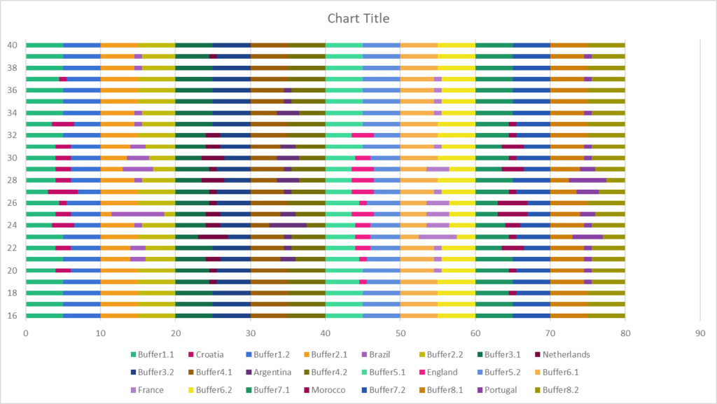
As next step, I will create a stacked bar chart with all dataset. Excel set the maximum of the x axis as 90 because we had a total of 80 for all ages.
Then I will change the maximum of the x axis as 80 because I don’t need to see between 80 and 90 in the chart.
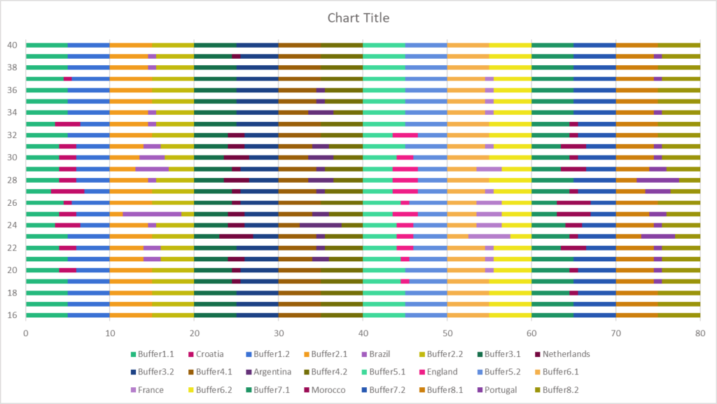
After that I will change the fill of the buffer bars to No Fill in order to hide them.
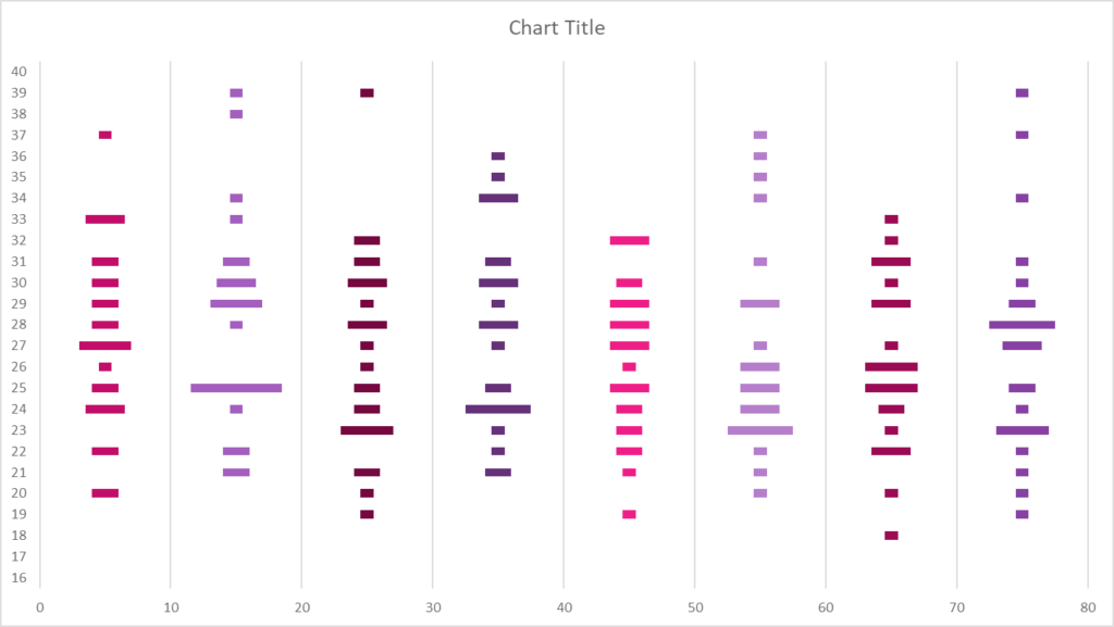
Afterwards, I changed the gap width to 50%.
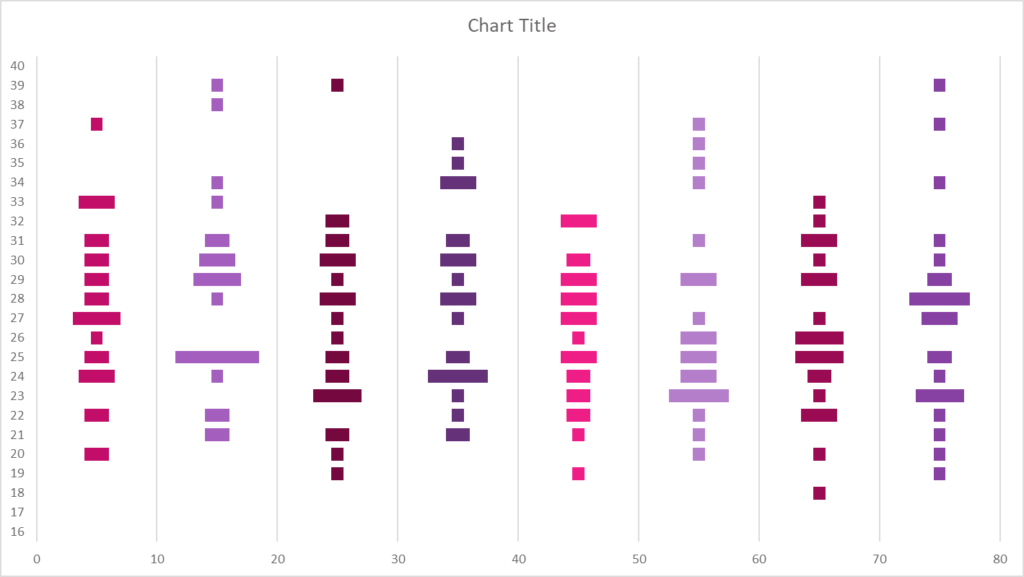
I removed the border outside the chart area and moved the chart title to the upper left corner for general format editing.
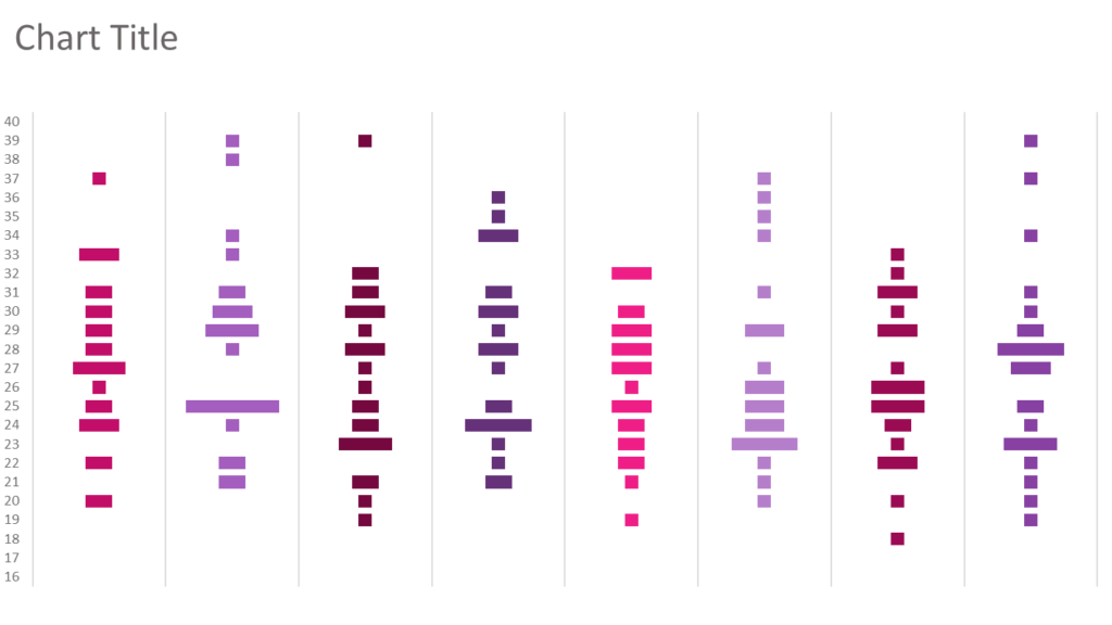
It’s time to create our bees 🙂 I copy and paste a circle inside the first team’s bars so that the size matches the size of the bar representing a single player.
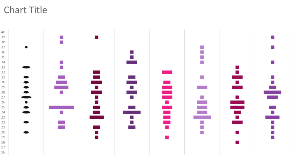
Then I right click on the bars with circles and choose Format Data Series. In the Picture Fill settings, I tick “Stack and Scale with” option, instead of Stretch.
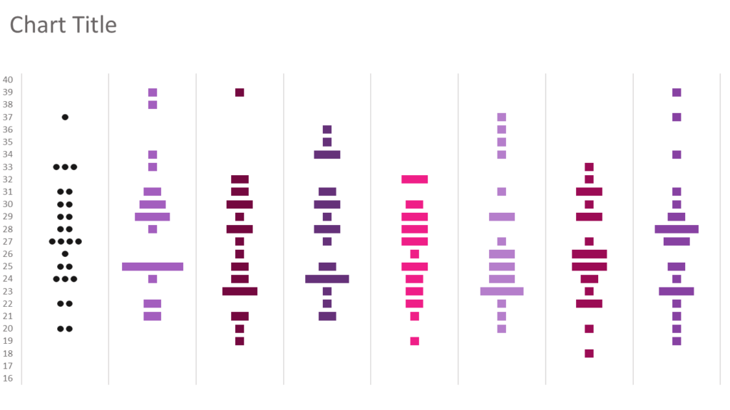
I repeat all the circle fill steps for the other teams. If you want you can change the color of the circles in order to create seperation or categorisation between countries. I used black circles (bees) for all teams.
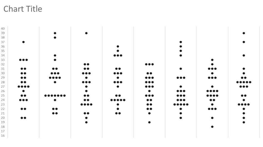
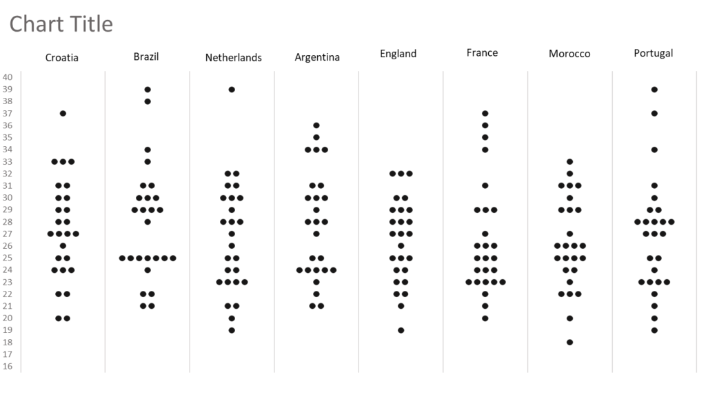
Then I added the name of each country as a text box.
Somewhere outside the chart, I stacked 5 equally sized rectangles and formatted them with diverging colors. Then I selected and copied all of them together and right clicked on the plot area, selected format, and placed the group with Picture Fill/Clipboard option.
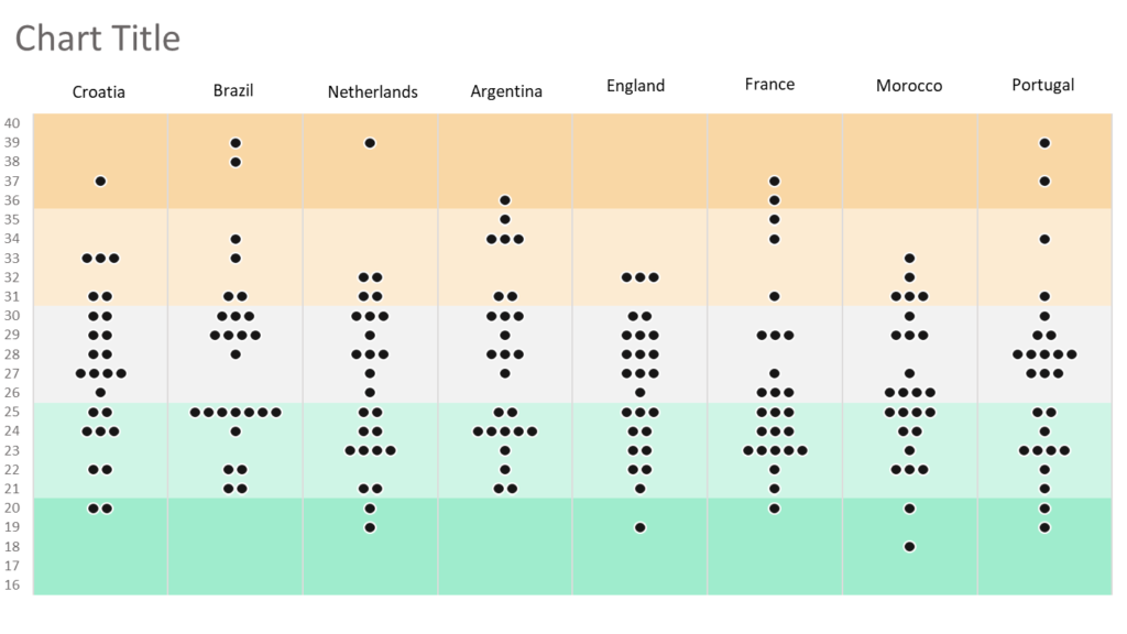
After the final makeups, my bee swarm chart is ready in Excel.
